Well I passed my Drawing 1 Course with 71 %. I am so chuffed.
Expanse. Part 3. Formative Feedback from my tutor. Reflection.
‘Thank you for sending in a good selection of work through the post, with your A 2 piece for Assignment 3, and drawings for each of the 5 sections of Part 3-Expanse. You also sent a clear list of learning log/blog posts relevant for this section and a list of work. This organised approach helps in identifying and looking at the work.’
I am striving to be organised with my art pieces and I am really glad you were kind to acknowledge this. I am trying with my blogs to organise them in a way that they are easy to read.
‘You have pulled together different skills used in previous exercises to really make decisions about composition of your final piece and in doing so produced a strong structure for your final piece.’
Thank you for saying this, I have worked hard to look and work with composition in my work. Using photos, sketches and artist reference to help me. This approach is not only enjoyable, but necessary to my thinking and development of my work.
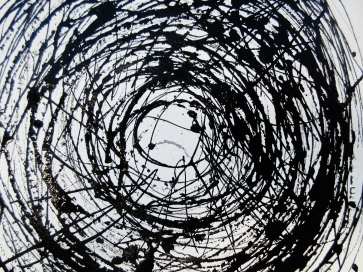
‘During your ‘sketchbook walks’ you made some very good drawings. The drawings in pencil around Jersey farm stand out, as do the six images you made for the 360 degree exercise. Many from your range of clouds studies are exciting. You did some beautiful sketches in colour of groups of trees.’
Doing these exercises were my favourite part of this course so far. I love being outside, looking and studying the weather and landscape shapes and colours. In fact all the cloud studies I actually, sat or stood to draw them in real time. For the inky cloud study on toned paper, I drew by dipping my reed pen in ink and doing speedy sketches, these were clouds high up and moving very fast too.
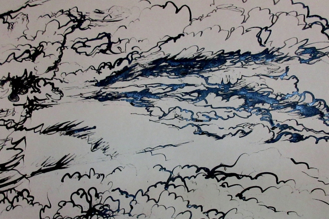
The sketches below are some of my favourite drawings, I enjoyed playing with light and dark areas. As you said ‘there are some grand shadows in these small drawings’


‘Each of your assignment pieces so far has included colour. This is absolutely fine. I would like to be sure you feel you could, if you wished, submit a final assignment piece of drawing in black and white, grey scale or monochrome, if you were to decide this best suited the particular piece you are working on.’
To answer this is simple, some of the exercise criteria requests and instructs us to explore tone in colour. Having said that, is not verbatim, and as I have always used colour in my ‘normal work’ and it’s leaked over into my course exercises. I love working with black lines and inks, so as I do a lot of this I thought I would be ‘experimental and creative’ by introducing colour images. Much of my sketches are in pencil, as it’s an immediate and easy medium to use. However it’s terrible to photograph a pencil drawing on white paper.
‘Moving from line based drawing, whether pencil, pen, or pen and ink, to the inclusion of colour washes, can be done in many ways.’
If I were to re-work assignment 3, ‘My Garden’ I would probably draw it in one colour and include more textures. But I didn’t want to ‘copy’ the style of Van Gogh, who I was influenced by. Hence to use of colour washes and I was trying to be individual.
But your suggestion of ‘would it be a useful exercise for you to take this step further and make a drawing, not a copy so much as a version, of one of Van Gogh’s drawings and one of his paintings (as he did sometimes himself?)’ is an interesting idea and I would be willing to try it out.
I think I struggle with this issue of colour verses monochrome. The assignments, plus the exercises pose many questions regarding the use of materials, and whether to ‘paint’ or draw in one or many colours. Then that’s the nature of an art course, to ask yourself questions, but not always come up with the right answers either. I know that I need to reflect on this more in my blogs.
You will find in Part 4 I have worked mostly in black, grey or monochrome. Including my assignment 4 pieces are all in one or two colours.
What have I learnt from Expanse-Part 3 for my personal improvement ?
I have improved my knowledge of composition, and how it’s important in landscape art to create balance and interest in pictures.
Choosing the correct materials for the final image. Also exploring materials that feel creatively right for me to use. Such as I often avoid pastels, and would default to inks and pens.
Researching artists is very important to inform my art and knowledge. I did look at Margaret Mee as you recommended, but didn’t make the Mantegna and Bellini exhibition at The National Gallery. However I did read and look at some of their work on line.
Making decisions in hard, but to accept that working in art is full of questions.
Areas for development
‘keep noticing and reflecting on the range of ways you are combining line drawing with colour, in order to discern between different processes and make choices which work best for each piece’
I will try to do this in my blogs and sketchbooks in future, but it does cause me conflicts. So some more research into how other artists use colour washes in their work.
The Figure and the head. Part 4. Artist Research, page 106. Contemporary Artists who work on the face in different ways.
Look at contemporary as well as historic artists who work on the face in different ways. Look at the subtle approach of Graham Little who uses coloured pencils and fine repeated marks and lines. Now look at the more fluid blocking in of tone by Elizabeth Peyton. Both artists use colour to draw the face in a ‘painterly’ manner.
Graham Little
Graham Little blends Romanticism and Postmodernism in his intricately detailed gouache and colored pencil drawings, in which he revels in the textures, patterns, and composition of fashion advertisements, while simultaneously re-positioning its female subjects as emotionally complex protagonists (as opposed to living mannequins). Sourcing images from such iconic fashion magazines as Vogue and Harper’s Bazaar, dating from the mid-1970’s to now, he works for months on an individual drawing, altering the advertisements to suit his own vision. In his drawings, the flat, glossy magazine images are transformed into richly textured scenes, abundant with objects and variously patterned textiles, centered upon a solitary, inscrutable woman. Little’s vignettes are enigmatic and evocative, as are his women, who often appear moody, contemplative, or quietly animated.
https://www.artsy.net/artist/graham-little
http://www.artnet.com/artists/graham-little/untitled-2002-KVtB7KEIEZJX-nPO7p1wgQ2
Elizabeth Peyton
Elizabeth Peyton is a contemporary American painter best known for her intimate, small-scale portraits of celebrities, friends, and historical figures. Characterized by transparent washes of pigment and a jewel-tone palette, Peyton’s works address notions of idolatry and obsession. “A painting of a person can be descriptive, but for me it’s about all the things that make up a picture—the feelings, the brushstrokes—more than describing somebody,” she has said. Notable figures she has painted include Kurt Cobain, Barack Obama, and David Bowie. Born in 1965 in Danbury, CT, Peyton went on to study at the School of Visual Arts. In 1993, she held a solo show of drawings in room 828 of the historic Chelsea Hotel, launching her career in the art world. By her second solo exhibition in 1995 at Gavin Brown’s enterprise, she had achieved widespread acclaim, and has since held major exhibitions at the New Museum in New York, the Royal Academy in London, and the Mildred Lane Kemper Art Museum in St. Louis, among others. For her interest in portraiture, her work has been compared to Robert Mapplethorpe, as well as to other contemporary figurative painters such as John Currin and Lisa Yuskavage. She lives and works in New York, NY.
http://www.artnet.com/artists/elizabeth-peyton/
https://gladstonegallery.com/artist/elizabeth-peyton#&panel1-1
Maggi Hambling
Hambling is a painter as well as a sculptor. She is known for her intricate land and seascapes, including a celebrated series of North Sea paintings created since late 2002. She is also known for her portraits, with several works in the National Portrait Gallery, London.
https://en.wikipedia.org/wiki/Maggi_Hambling
‘Do you always have to like the people you paint?’ She says: ‘Portraits are about love… Well, it’s all about love, right Wakefield? The whole thing is about love and you can’t make a work of art without love.’ What a happy antithesis Maggi is to the late Lucian Freud. For Maggi, the artist has to forget herself, inhabit the subject. For Freud, every portrait, every subject he painted was autobiographical. ‘It is all about myself,’ he said. You can tell.
https://life.spectator.co.uk/2018/09/maggi-hambling-you-cant-make-art-without-love/
http://www.marlboroughlondon.com/exhibitions/maggi-hambling-portraits-of-people-and-the-sea/
Marlene Dumas born 1953
Marlene Dumas was born in Cape Town, South Africa. From 1972 to 1975 she attended Cape Town University, where she studied for a BA in Visual Arts. She then completed her studies in Haarlem, in the Netherlands.
She has lived and worked in Amsterdam since 1976. From 1978 she has exhibited internationally, and is one of Holland’s most widely admired artists. In 1995 she represented Holland in the Venice Biennale, and in 1996 the Tate Gallery exhibited a selection of her works on paper.
In the past Dumas produced paintings, collages, drawings, prints and installations. She now works mainly with oil on canvas and ink on paper. The sources she uses for her imagery are diverse and include newspaper and magazine cuttings, personal memorabilia, Flemish paintings, and Polaroid photographs. The majority of her works may be categorised as ‘portraits’, but they are not portraits in the traditional sense. Rather than representing an actual person, they represent an emotion or a state of mind. Themes central to Dumas’ work include race and sexuality, guilt and innocence, violence and tenderness.
https://www.tate.org.uk/art/artists/marlene-dumas-2407
Pablo Picasso
Known as one of the most prolific painters of Modern Art, Pablo Picasso was undoubtedly a man of many talents. The Spanish artist experimented with and excelled in many mediums, from painting and drawing to sculpting and collaging. In addition to different art forms and unique materials, however, Picasso also worked in a spectacular array of styles. This constantly changing aesthetic approach is evident in his series of self-portraits, which he painted from the age of 15 until 90.
While many people recognize him only for his avant garde, topsy turvy paintings, his earlier work—like his self-portraits from 1896 and 1900—exhibit his ability to paint and sketch beautiful true-to-life depictions. Though a gifted draughtsman, Picasso did not dabble in this style for very long. In 1901, he entered his Blue Period—a phase in which he painted somber, stylized scenes in cool blue tones, as evident in his striking self-portrait from the same year.
https://mymodernmet.com/pablo-picasso-self-portraits/
https://www.npg.org.uk/whatson/picasso-portraits/exhibition.php
Rembrandt
Rembrandt was the greatest Dutch painter of his age and is one of the most important figures in European art. The many self-portraits he painted throughout his life provide us with a visual autobiography.
Rembrandt van Rijn was born on 15 July 1606 in Leiden, the son of a mill owner. In 1621, he began training with a local painter and in 1624-1625 he was in Amsterdam, studying with Pieter Lastman who had been to Italy and now introduced Rembrandt to international trends.
Rembrandt settled permanently in Amsterdam in 1631 and set up as a portrait painter. One of his first major public commissions was ‘The Anatomy Lesson of Dr Tulp’ (1632). In 1634, he married the well-connected Saskia van Uylenburgh. Rembrandt prospered, painting mythological and religious works as well as portraits, and the couple lived well.
One of Rembrandt’s most well-known paintings, ‘The Night Watch’, a group portrait of one of Amsterdam’s militia companies, was completed in 1642. Saskia died in the same year, which coincided with difficulties in Rembrandt’s business. This, coupled with his extravagance, resulted in him being declared bankrupt in 1656. His house and possessions were sold, including his own large collection of works of art.
After Saskia’s death, Rembrandt had an affair with his son’s nurse, but they quarrelled and he later began a relationship with his housekeeper, Hendrickje Stoffels. She frequently modelled for him.
Rembrandt continued to receive commissions and some of the great paintings from this period are ‘The Syndics of the Clothmakers Guild’ (1662) and ‘The Jewish Bride’ (c. 1666). Rembrandt was interested in drawing and etching as well as painting, and his etchings were internationally renowned during his lifetime.
Throughout his career, he attracted pupils who also served as his assistants. Their work can sometimes be hard to distinguish from Rembrandt’s own.
Rembrandt died on 4 October 1669.
http://www.bbc.co.uk/history/historic_figures/rembrandt.shtml
https://www.nationalgallery.org.uk/paintings/rembrandt-self-portrait-at-the-age-of-63
https://www.artsy.net/article/artsy-editorial-rembrandt-genius-sage-snob-left-mysterious-legacy
The Figure and the head. Part 4. Project 2 Proportion. Exercise 1 Quick studies Exercise 2 A longer Study
In this exercise you’ll draw your model in a comfortable position. Having something in the background helps identify the space and will help you place the figure so that it doesn’t appear to be floating in space. Draw five two minute sketches of the model in your sketchbook, paying attention to proportions and just the basic lines that describe the figure. Make rapid sketches to lock your concentration onto what is essential; making immediate assessments and trusting them.
From September to December 2018, I attended Life Drawing sessions with St Albans Art Society, drawing for two hours per week. These are not taught lessons, except for the evening on ‘Drawing the Clothed Figure’. Many of my sketches are either one minute, two minute up to fifteen and twenty minute poses. I worked mainly in my sketchbook and on sheets of paper, using soft pencil, ink and pastels. In my sketchbook I added some coloured papers to use as a background. Sometimes I drew on the white surface or a coffee coloured ground.
I already have a City and Guilds Certificate in Life Drawing, which I did many years ago, so I am familiar with drawing the nude and clothed figure.
Here are a selection of one and two minute sketches from my sketchbook.

One minute sketch

One minute sketch

Two minute sketch

Two minute sketch

Two minute sketch
Work on two larger two minute drawings. Be free in the use of your medium and don’t erase any incorrect lines. Keep drawing over and over until the lines and marks begin to work.
Here are two ten minute sketches I drew with pen. I decided to draw multiples of the man, as I was struggling to get his overall shape. The drawing on his own shows and extra practise sketch where I started too far across the page, his arm holding the stick was foreshortened so quite tricky to draw. You can see I drew many lines and left them, it seems to add to the quality of the line and gives the figure some movement. I can see his legs are not quite right in the first sketch, but slightly better in the second one. Pen is challenging to draw with as you can’t rub out errors, but I like that. Pencil is good for smudging and drawing quickly especially if your time is limited.

Ten minute sketch

Ten minute sketch
To get the shape of all these figures, I used the background the place certain parts of the body, but I didn’t draw in the background in, except for a mat the figure was standing on. I also applied the use of positive and negative shapes, which I practised in the Still Life exercises.
Exercise 2 A longer study
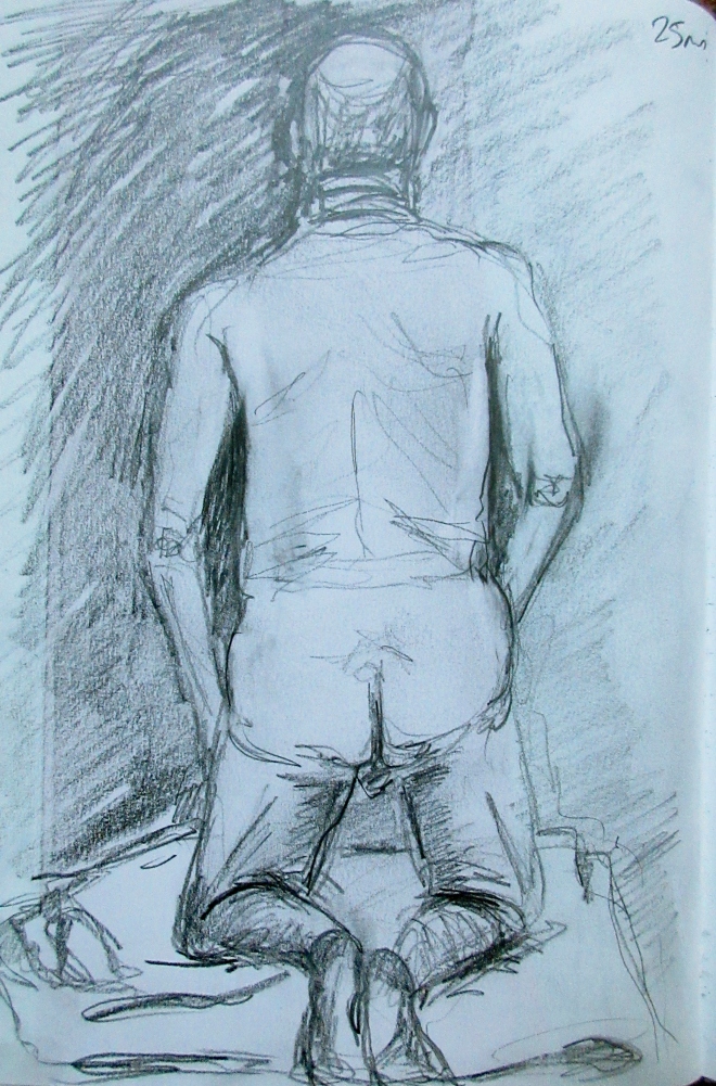
Here is a longer study of the back of a man drawn with soft pencil. This was a difficult pose because of his feet and angle of his legs. Again foreshortening issues for the thighs and calves. I played around with shading and scribbling to get the man’s overall shape, that includes shading the background around the man. I think the background shading helped to develop the line and positive/negative space. I tried to describe the weight by drawing the pillow he was kneeling on with loose lines. This sketch looks like the model, he was an elderly chap, with some creases and wrinkles on his skin, I treated these marks with soft smudging and line. I think his feet could be slightly larger, but they were curled under the pillow.
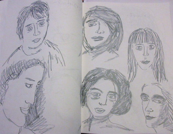
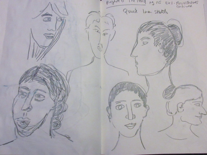
The Figure and the head. Part 4. Project 6 The head. Exercise 1 Facial features. Exercise 2 Your own head.
‘Look at people (including yourself) in the flesh, in magazines, TV and other places and study individual features……….’ page 105.
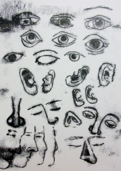
Here are my sketches of facial features. Eyes. I have drawn some with line and some in tone using a soft pencil. The middle drawing is of my eyes, reflected in a mirror. The other eyes were from magazines, books and TV.

Eyes in pencil

My eyes

Eyes in pencil
Here are some sketches of noses. Different views including a side face view.
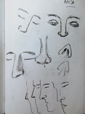
Here are a selection of ears, I drew my family’s ears and some from books. Sketched in pencil. I like the large loop earring in my daughter’s ear.

My family’s ears

Ears in pencil
Here is a mono print in black ink of a collection of facial features. I like the way the ink has created fuzzy edges to the drawings.
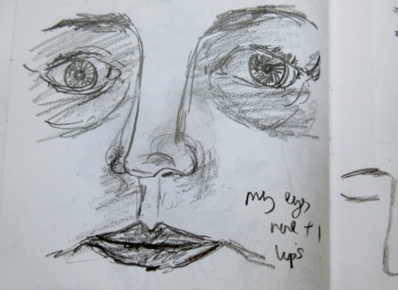
Here is a quick sketch of my facial features, using line and tone.
Using my sketches as reference I drew some quick sketches of heads I saw on TV, internet and newspapers. I did quite a few drawings just to practise different view points, expressions, lines and tones.
Reflection
Facial features are very abstract, eyes look like lemons, ears like a foetus and noses like angled shapes. Drawing the features face on is quite hard, as the nose becomes a difficult shape, it loses it’s sense of line and shading is now important to get the form. Eyes have other parts such as eye lids, eye lashes and creases to deal with. Plus the eyes give expression and feeling, so capturing this in line was easier for me, than trying to use shading and tone. Ears were fun to draw, they are so individual and have lots of shadowy areas to draw. Drawing an earring added character to the flesh and would help in giving identity to a full portrait.
Exercise 2 Your own head
First drawing.
Here are some sketches of my own head, I looked into a mirror to help me get a likeness.
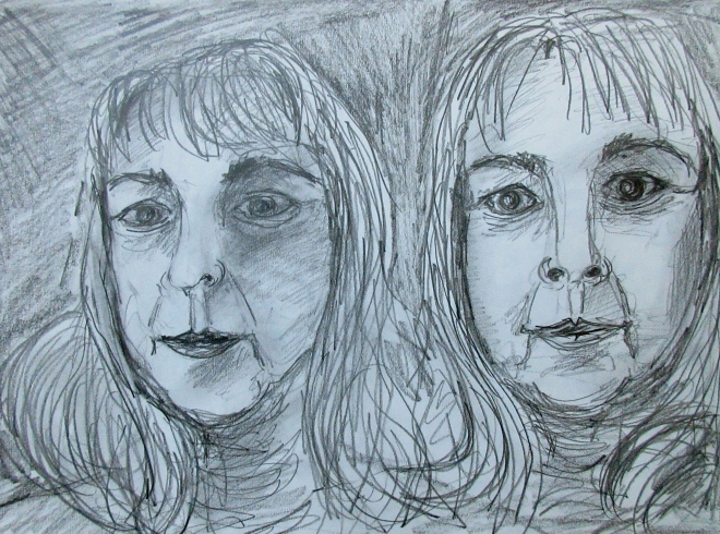
Reflection
I’m not sure what I think of drawing myself, I know many artists like to create their own portraits. Anyway I sketched mine using a soft pencil and worked quickly to get down a basic head shape, I think drawing the hair was the easiest place to start, then roughing out the eyes was the hardest, I did have to rub them out a few times until I got a good shape. The nose I left open with only a few lines to describe it. The lips look like mine. Overall it looks like me, but I felt uncomfortable drawing myself and that include looking in a mirror to do this exercise. Drawing a self portrait is tiring, emotional and worrying.
Reflection.
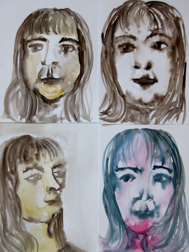
Second drawing in watercolour paints and Marlene Dumas
I decided to create my second self portrait in watercolour paint. I research the artist Marlene Dumas, as I was impressed with her very loose watery portraits. Dumas paints ‘second hand image’, she works, not from life, but from mass produced images in the press or magazines, famous people and her own family, and her self. Her thinking is that the ‘second hand image’ creates ‘first hand emotions’. https://www.tate.org.uk/whats-on/tate-modern/exhibition/marlene-dumas-image-burden
I was interested in the idea of working from a ‘second hand image’ as I painted the images below by copying my pencil drawings above. I have struggled with this exercise, because it’s self portrait and I hate looking at myself in a mirror. So I felt emotionally happier to paint from my drawings, I did take a few photos of myself to use as reference and I even found using those very depressing. In terms of painting I used a ‘wet into wet’ method, which is unpredictable as a technique, and I could just paint freely without the pressure of making a likeness of myself. Painting a front view was easier than a side view, however I had problems with spacing my eyes. I much prefer my pencil drawings, as they show the ‘quirky’ side to my personality through the pencil marks and lines. The watercolour painting, even though it was enjoyable, lacks that energy, but has captured myself in thought.
I showed both drawing and painting to my husband, and he felt I didn’t look like that and I should have made my skin smoother and less wrinkled. Well my response was, I have wrinkles as I am sixty two ! I know he sees me as some young person he fell in love with years ago (and still does), but I have changed, and drawing myself puts everything into perspective. It’s made me think of questions, rather than answers. Such as, what is a portrait? What emotions does it evoke ? Does it have to be a full face image? Are the materials you use are important? Why paint a portrait, when digital photography is so good ?
Additional drawings in Conte pencil

Self portrait sketch

Self portrait sketch

Self portrait sketch
The Figure and the head. Part 4. Artist Research, historic and contemporary artist whose work involve the underlying structure of the body.
Research Point page 101.
Contemporary Artists whose work involves the underlying structure of the body
Damien Hirst (born 1965)
Hirst is an English artist, collector and curator. He is one of the Young British Artists, who became famous in the 1990’s. He is known for organising and curating Freeze exhibition in a disused warehouse for his fellow Goldsmith students. Hirst is one of the richest living artists today.
I chose Damien Hirst to study as I saw his exhibition at Houghton Hall, Norfolk, this year. I was impressed with his large sculptures that incorporate the human body. I know Hirst explores themes mainly to do with death. Hence his famous series of dead animals in formaldehyde. However I really like his painted bronze sculpture of ‘Sensation’ 2003, it looks like a slice of cake, but is in fact a section through the skin. In comparison the over sized sculpture of ‘The Virgin Mary’ (2005-2006) set in the ground of Houghton Hall is quite magnificent, it’s of a pregnant woman with the right side flesh peeled back to expose muscles, bone and baby. ‘Anatomy of an Angel’, 2008 is a beautiful white marble statue of a female angel with half her body exposed to show the form underneath the skin. ‘Death and Glory’2001 in The Cabinet’ displays a skull and eyes divided between glass sheets. His ‘Saint Bartholomew, Exquisite Pain (2006) is a bronze figure with a pair of scissors in one hand and over an arm the flesh of a body on the table are some mathematical instruments.
Looking at Hirst’s work, you see that he uses a wide variety of materials to make his work, (well we know he employs others to carry out his ideas) and that’s what I found interesting about the exhibition at Houghton Hall, the large sculptures were set in the grounds and did have a sense of dominance and grandeur. As you were made to ‘look up’ at them I felt quite small myself, knowing some of these sculptures, like ‘Hymn’ and ‘Temple’ (2008) were inspired by the Humbrol anatomy toys which are in small size.
I have to mention Hirst’s most expensive piece of art, being, ‘For the Love of God’ (2007), modelled on a real human skull, was a platinum skull covered in 8,601 diamonds, costing £15,000,000. In November 2008, the skull was exhibited at the Rijksmuseum in Amsterdam next to an exhibition of paintings from the museum collection selected by Hirst. Wim Pijbes, the museum director, said of the exhibition, “It boosts our image. Of course, we do the Old Masters but we are not a ‘yesterday institution’. It’s for now. And Damien Hirst shows this in a very strong way”. https://en.wikipedia.org/wiki/Damien_Hirst
http://www.damienhirst.com/
https://www.houghtonhall.com/art-and-exhibitions/damien-hirst/
Jessica Burke Born in Wichita, Kansas, Jessica Burke is a figurative artist and educator living in southern Georgia.
Whilst researching I found this working artist in America. She has created, using the human skeleton a set of brightly coloured images, revealing and exposing their identity by ‘dressing’ them up as characters from t v and films. Her drawings are realistic and detailed, she uses Prismacolor, graphite, watercolour and oils. The collection of drawings explore, ‘the fiction of identity through its performance in physical and cerebral spaces that demonstrate a willingness to project and construct meaning. While these sentimental figures are absorbed with their own fantasy, they are still compelled to subvert conventional roles and relationships. They can acknowledge the absurdity of their circumstance by embracing the cultural detritus of the banal’.
https://www.jessicaburkeartist.com/pop-portraits/
Rene Magritte (1898-1967)
Rene Magritte a Belgian Surrealist artist, was famous for his witty and humorous work, with bowler hats and apples. In the 1960’s Magritte’s art influenced many contemporary artists we know today.
Magritte often portrayed the human form in his paintings. These forms were often morphed and placed in surreal backgrounds and settings. ‘Les Merveilles de la nature’, The Wonders of Nature, 1953, oil on canvas is a painting of fish humans with a sailing ship in the background, here Magritte has painted very realistic legs and torso with fish heads. At the age of 13, Magritte’s mother was drowned, her body was found with her nightdress over her head and she was naked from the waist down, even though Magritte denied that his work was influenced by this trauma, he still painted heads covered in scarves, female corpses in nightdresses, faces with missing parts and swirling waters. Magritte made bronze sculptures of face parts, eye, ears, lips and noses stacked up on each other. ‘The White Race’ (1967).
https://www.telegraph.co.uk/culture/art/8601525/Rene-Magritte-The-Pleasure-Principle-Tate-Liverpool-review.html
https://www.tate.org.uk/art/artists/rene-magritte-1553
https://en.wikipedia.org/wiki/Ren%C3%A9_Magritte
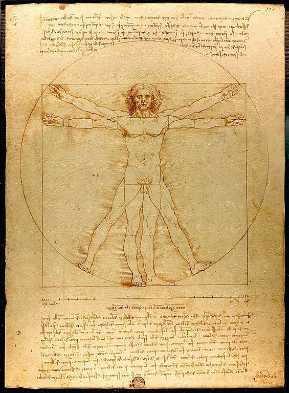
Leonardo da Vinci (1452-1519)
Leonardo is the most famous polymath artist, know for his painting of the ‘Mona Lisa’ and drawing of ‘Vitruvian Man’. Including his studies of Human Anatomy and sketches of animals.
‘As a successful artist, Leonardo was given permission to dissect human corpses at the Hospital of Santa Maria Nuova in Florence and later at hospitals in Milan and Rome. From 1510 to 1511 he collaborated in his studies with the doctor Marcantonio della Torre. Leonardo made over 240 detailed drawings and wrote about 13,000 words towards a treatise on anatomy’ https://en.wikipedia.org/wiki/Leonardo_da_Vinci#Scientific_studies
Assignment 3. Part 3 Expanse. ‘My Garden’ Drawing.
Assignment 3
Draw an outdoor scene of your choice. Try to find a view that includes some natural objects- trees, shrubs, pot plants, fields, garden plants. Also try to find a view that will allow you to demonstrate your understanding of aerial or liner perspective- in other words a view that has some demonstrable depth. Look for a view that offers an opportunity to draw straight-lined objects as well as items drawn from nature; buildings, walls, fences, gates and so on. This seems a lot to look for, but most views from windows and doors will offer you a bit of all of these things.
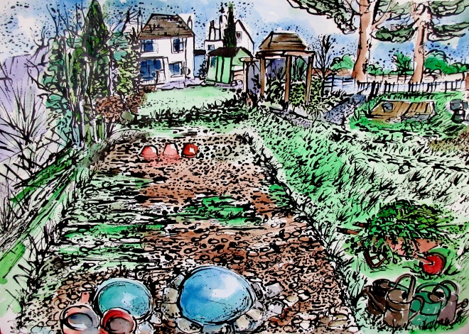
Here is my final drawing for Assignment 3. Part 3 Expanse. I have called it ‘My Garden’.
 I became interested in drawing my garden whilst reading about Van Gogh’s ink and Reed pen drawings of gardens. During his life time Van Gogh drew an extraordinary amount of pictures, many portraits, landscapes and my favourites, his gardens. He was largely self-taught, believing that drawing was ‘the root of everything.’ His reasons for drawing were numerous. He felt it necessary to master black and white before attempting to work in colour. Drawings formed a complex part of his development as a painter. There were periods when he wished to do nothing but draw.
My favourite Van Gogh garden drawings are those created in Arles during 1888. In my sketchbook I have dedicated a few pages to his work.
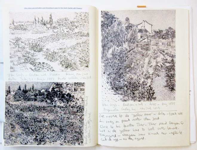
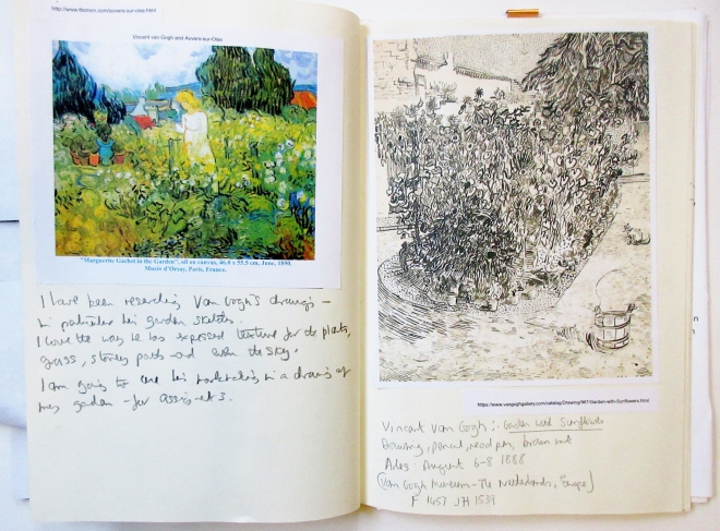 From http://www.vangoghgallery.com
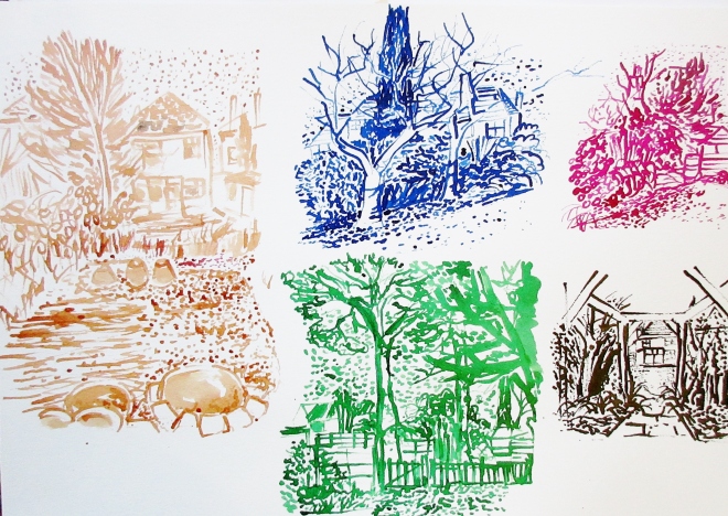
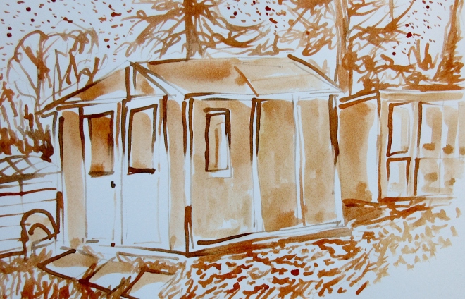
The reason I chose Van Gogh’s drawings are simple, I am interested in the textures, mark making and the forms he made using simple and cheap tools, reed pens and inks. I wanted to use some of his mark making ideas in my own drawing.
So to practise these marks, I drew with a reed pen and Indian ink in my sketchbook, and in Part 1, I also researched Van Gogh’s marks on a tone paper, which I have included here.


Reed Pen and Acrylic Ink

Mark making like Van Gogh using a Reed Pen and Ink.
For my final drawing I decided to take a variety of photos of my garden, to help with the composition and perspective.
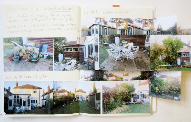
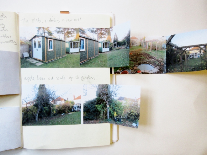
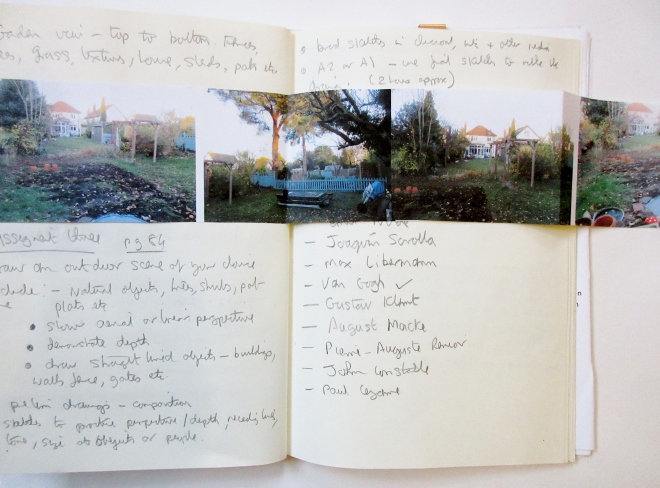
Using my photos and loose sketches I drew in coloured inks I knew this would make a good composition for a large A 2 drawing.
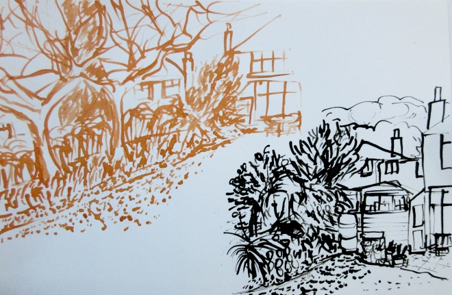
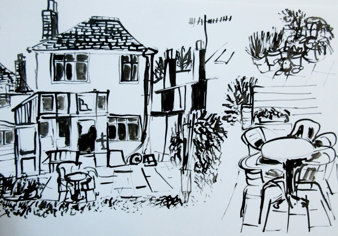
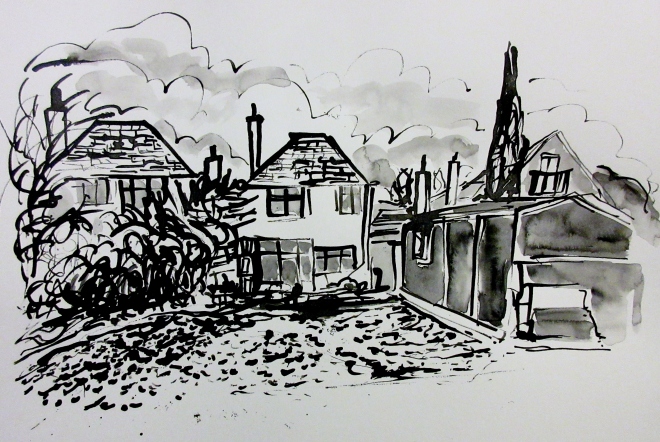
 Referring to some of my previous exercises on perspective, I decided to focus on one point perspective and a high horizon for my drawing.

one point perspective

Walk way in pencil
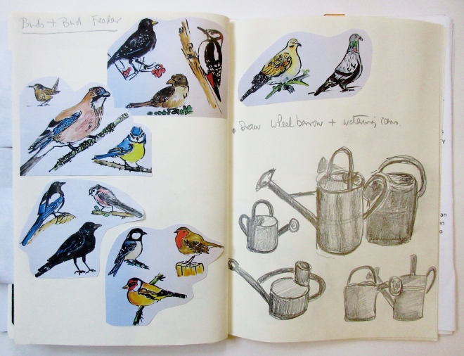
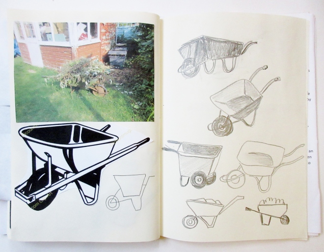
In addition I drew some extra features such as plant pots, wheel barrow and watering cans. I also painted some birds, they don’t feature in my final drawing, but I could often see them when I was sketching outside.
Materials for my final drawing; The Langton, Daler Rowney Watercolour paper, 300 lb weight, size A2 (594 X 420 cm), black Indian ink, Reed pen, and White Nights watercolour paints.
So using my reference materials I started to draw my garden sketching out with ink and pen first, and then building up the mark making and textures, letting some layers dry out. Once I had an overall picture and it was dry I dropped in some loose watercolour washes. I decided on a limited palette of Sap Green, Violet, Dark Green, Brown, Paynes Grey and Cobalt Blue. Leaving the white of the paper for the highlights and some tones.
This is my drawing with a light colour wash.
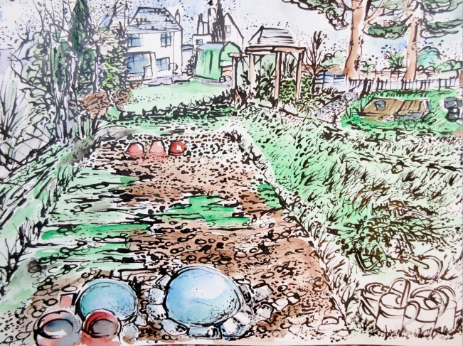
And my final drawing with more textural marks and dark tone watercolour washes.
My Reflection and Assessment Criteria points
Demonstration of technical and visual skills- materials, techniques, observational skills,visual awareness, design and compositional skills.
I feel I have shown my technical skills by demonstrating my use of perspective (one point perspective) by drawing my garden from the top towards the house, with a slightly side view. There were additional perspective issues regarding some of the sheds and fences, but these all lead to a vanishing point. Also I made many observational sketches and took photos to help me with my composition. Which made me decide to have a high horizon, giving me a big foreground to play with. I chose the relevant materials for watercolour and inks, watercolour paper is strong and has the correct surface that can hold ink and water without damaging the paper.
I wanted to make a visual record of my garden that also showed my skill with ink drawing and watercolour painting.
Quality of outcome-content, application of knowledge, presentation of work in a coherent manner, discernment, conceptualisation of thoughts, communication of ideas.
I always try to present my work in a way, that I hope is enjoyable to the viewer and easy to follow. I enjoy artist research and hopefully this shows in my explanation and reasoning for the progress of my work. I have tried to photograph my sketches and drawings from my sketchbook, so they become an integral part of my reasons and concepts for my final piece.
Demonstration of creativity- imagination,experimentation,invention, development of a personal voice.
I believe I am a creative thinker and I like to experiment with materials. In my final piece ‘My Garden’ I decided to work larger, which has it’s challenges, and using Indian ink with a reed pen gives an unpredictable result. I am trying to develop a personal voice by following my spontaneity in my drawing and pushing myself to explore new and exiting subjects.
Context reflection-research, critical thinking (learning logs and, at second and third level, critical reviews and essays)
I continue to use a logs and record my research and exercises, in addition I enjoy reading and writing about interesting artists. For this assignment I researched Van Gogh, Claude Monet, Emil Nolde and Utagawa Hiroshige. I chose these artists for their use of mark making, colour, composition and their observations in drawing, painting and printing gardens.
Reflecting on my work is often hard to do and I don’t find writing about myself very easy, something I need to practise.
Final Thoughts
I wanted to say how much I enjoyed this assignment 3, drawing outside, taking photos and reading about Van Gogh has been very interesting. My final drawing was created quite spontaneously, it does have faults, such as the right side is slightly too big, but I really explored making textures with ink. I wanted to show my skill with watercolour paints and hopefully I did this. I have tried to draw on and use my exercises to help me with this final drawing. It took me about three days to draw my final picture, as I needed to wait for it to dry between layers. Taking time has it’s benefits, time gave me a chance to look and observe closely and in detail.
Looking at the beauty of Van Gogh’s drawings has really inspired me, he always surprises me with his skillful draughtsmanship, stunning mark making and wonderful composition.
Reading
Rainer Metzer Ingo F. Walther. Vincent Van Gogh 1853-1890. Taschen 2008.
Sjraar Van Heugten, Van Gogh draughtsman, The Master Pieces. Van Gogh Museum. Mercatorfonds. Publication that accompanies the exhibition, Van Gogh Museum, Amsterdam, 2 July 2005- 18 September 2005. The Metropolitan Museum of Art, New York, 11 October 2005-31 December 2005.
David Sauders. RSPB Guide to British Birds. Hamlyn Publishing Group Ltd, 1975
The Figure and the head. Part Four. Project 1 Fabric and form. Exercise 1 Drawing fabric using line and tone. Exercise 2 Emphasising form with cloth.
Here is my cloth drawing in line and with tone, drawn with soft pencil on paper.
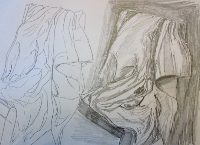
I found this an interesting exercise, as the folds were very abstract and difficult to keep track off whilst drawing. I had to shade light for the brighter areas and very dark for the deep folds. I was pleased to keep the shape of the chair whilst emphasising the cloth. This was a heavy cotton cloth quilt so the folds were deep and dark.
Here are the folds drawn in squares using pencil.
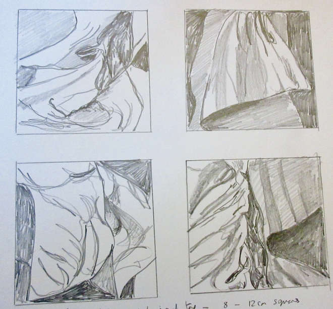
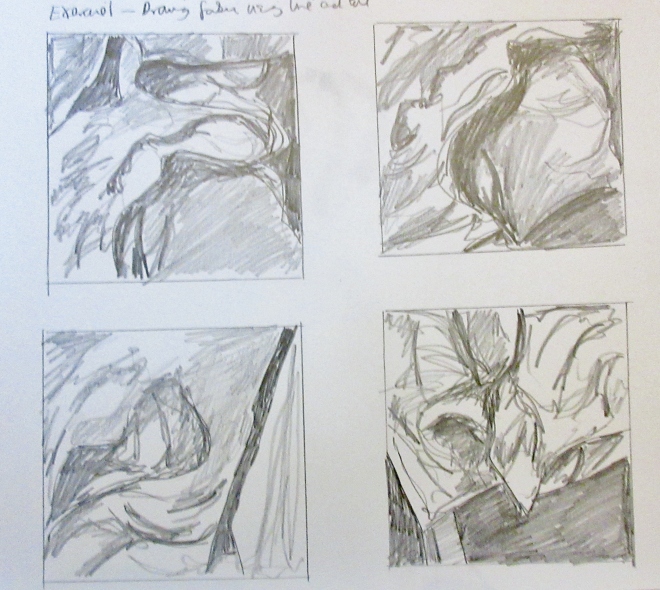
These squares were brilliant to draw, as each one was different and very abstract. Being in a square format, it made me focus more on the shapes and contrasts of the folds. I tried very energetic lines and marks to describe the cloth, using a soft pencil was the right media choice.
Exercise 2 Emphasising form with cloth
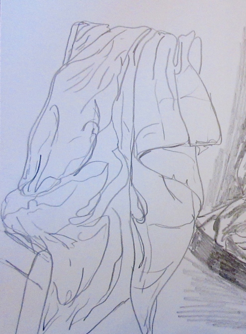
I drew in pen these two very quick sketches of my husband wearing loose clothing. I was trying to express the body shape by using the folds and shadows created by the light and dark areas. The drawing below is a close up of his top half, emphasising the jumper.
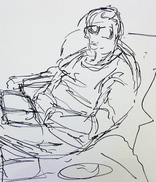
The drawing below is a whole view of my husband lounging in a chair.
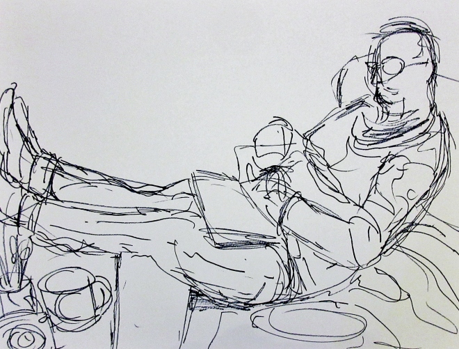
The main problem I had was drawing the human shape, and getting the proportion and length of his legs. I drew in a loose sketchy way, trying to avoid one outline line. I think I managed to capture the jumper with it’s folds and creases, showing where it bends over at the chest and tummy. Drawing with an open free line also helped with getting the shape of his arm too.
Expanse Part 3. Project 3 Composition. Artist Research Tacita Dean,George Seurat, Robyn O’Neil, Serse Roma and Simon Faithfull.
Tacita Dean (born 1965) and George Seurat (1859-1881)
These are two very different artists, but have some similarities.
Dean works mainly with film, including drawing, photography and sound. She likes to utilise stories in her large chalk blackboard drawings, these are of Donald Crowhurst, an amateur English sailor whose ambition to enter a race to solo circumnavigate the globe ended in deception and tragedy. She also exploits the richness of the sea, lighthouses and ships.
Seurat was a French post-Impressionist painter and draftsman. Like Dean, he was highly motivated by the use of drawing media and for developing pointillism and Chromoluminarism, known as Divisionism. Divisionism is a style in modern art. It is the separation of colors into individual patches or dots that creates an optical interaction with the viewer’s eye once the colors are on the canvas. The colors used were pure, which were mixed optically when viewed.
Both artists use drawing to create monochrome images which reflect light and dark on different backgrounds, Dean’s on black and Seurat’s on white. Dean uses colour like Seurat, but her’s is the colour of 16 mm film, where as Seurat used a scientific approach to colour with a relationship to harmony and emotion. Both using soft and subtle tonal effects in their drawings.
")
Tacita Dean

George Seurat Landscape with Houses Artist:Georges Seurat (French, Paris 1859–1891 Paris) Date:1881–82 Medium:Conté crayon Dimensions:9 13/16 x 12 9/16 in. (24.9 x 31.9 cm)
Fatigues (E), 2012
Chalk on blackboard
Fatigues E: 90 1/2 x 219 in. (229.8 x 556 cm)
https://www.mariangoodman.com/artists/tacita-dean
Landscape with Houses, Georges Seurat (French, Paris 1859–1891 Paris) 1881–82, Conté crayon. Dimensions; 9 13/16 x 12 9/16 in. (24.9 x 31.9 cm) https://www.metmuseum.org/art/collection/search/337676
Robyn O’Neil (born 1977)
O’Neil, similar to Dean and Seurat, is passionate about drawing. Her precise graphite images are about evolution, apocalypse, natural disaster and extinction, very surreal. Like Dean and Seurat, O’Neil’s subjects are illuminated by light and dark, with shadows and marks. Her compositions are unusual with floating figures in craggy and rolling landscapes. Compared to Dean, O’Neil also uses stories and personal memories to inform her art.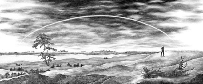
The Lost Landscape with rainbow. Based on Caspar David Friedrich. Graphite on paper. 2005. Size; 20 5/8 x 48 1/2 inches. https://www.robynoneil.com/drawings
Serse Roma (born in San Palo De Piave 1952)
This artist works with graphite powder and rubber on paper. Twenty years ago Serse renounced colour in preference for pure drawing, very similar to Seurat. Serse’s passion for a drawing is intense, themes such as, cloudy skies, high mountains, snowy woods, seas without people occur from light and shadow. Serse’s drawing is analytic, detailed, intimate and extreme.
Paesaggio adottivo, 2016-2017, graphite on paper, 13 x 18 cm
https://www.galleriacontinua.com/artists/serse-67
I seem to have chosen artists with an extreme passion for drawing, this is because I love the light and dark contrasts they created and the differences in composition, use of materials and development of stories, memories with familiar landscape subjects being treated in large formats, that’s stunning to the eye.
Simon Faithfull (born 1966)
A British artist see the world as a sculptural object. He works with teams of scientists, technicians and transmission experts to help him develop a very personal view of the world. Since 2000 Faithfull has abandoned paper.
I was interested in his ‘Limbo Drawings’ which he makes from using an app on his iPhone called Limbo. These drawings are made of pixels, so this enables Faithfull to sketch the lines so they are ‘floating’ over the ground. In fact he only draws a part of the image too, so they are restricted in detail. Quite the opposite of say, Serse’s detailed drawing. Faithfull’s new drawings are always dispatched to the world via the Limbo service and added to a growing database which has all of Faithfull’s drawings to date.
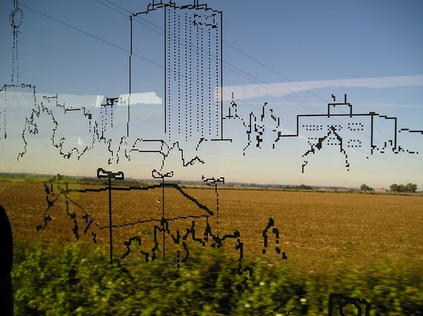
Parallel Lines 2005. http://www.simonfaithfull.org/works/limbo-2/
Reading
VITAMIN D New Perspectives in Drawing. PHAIDON. 2005.
Assignment 2. Intimacy. Formative Feedback from tutor and My Reflections.
Assignment 2. Feedback from Corinna Till dated 22th November 2018
My Reflections
I feel the feedback was positive and constructive, giving me the encouragement to reflect on my work.
I was really annoyed with myself for not sending in to my tutor two pieces of work, which were a big mixed media shell drawing, and a large pencil drawing of my hall. Next time I will be more positive with my art pieces, and send in larger art works. However I was happy that I had the opportunity to show Corinna these pictures via a video call.
Overall Comments from my tutor
‘It was exciting to see how you worked with the new subject matter of domestic spaces, after
the still life exercises. You made a lot of fresh, quick sketches, full of many possibilities and
were able to successfully develop some of your images of interiors through repeated
attempts at the same view. Your consideration of shifts in light and dark, and how much
space and detail to include and leave out, were productive lenses through which to develop
your compositions.’
Drawing the ‘At Home’ exercises were brilliant, and I loved doing them. I chose loose wet India ink and a Reed pen to draw with, as it gave me fluid lines and chances to make deep and light shadows, which I saw in my home.
Assignment 2
I found working for Assignment 2 very difficult, and it took me a long time, till I actually did the work. Basically I just didn’t know what to draw, plus the brief asked for a lot of different elements and choosing the right ones proved to be very difficult.
Harold’s Chair seemed a good choice to explore as it was in a room with a variety of light and dark shadows. But I chose to draw in coloured crayons, I used this medium as I had already used India ink and a Reed pen in Assignment 1 and wanted to show my drawing skills in a different way.
I do agree with my tutor, about the use of coloured crayons,
‘We talked about how the coloured crayons used for your final piece were quite difficult to
use and perhaps these crayons didn’t offer the best range of colour or tonal variation. We
didn’t talk about the paper. The paper you used seems to have been a really good choice,
the natural colour supporting your depictions of soft light.’
Throughout this course you are encouraged to draw with coloured crayons, which I though I would try. I found them very hard to work with and yes, getting a range of tones out of them very difficult to do. I now see how mixing pencil with coloured crayon did muddy the lines and muted the overall picture.
However, drawing in ink gave me the opportunity to express tonal values of different colours. So my sketchbook work and inky drawings were successful because of the medium I used. Art decisions are hard sometimes. Trying to chose the’right’ medium is harder, some of my drawings came out really strong and some quite weak, it’s made me realise how artists work at making long term decisions about their process and outcomes.
As for my Assignment 2, I did research William Scott’s still life art, as I though it would help me with drawing the table next to the chair including still life objects. I did quite few sketches of the round table, apples and jug in my sketchbook, and looking back at them now, I could make a new piece of work just from the table and still life. (I make a lino cut print in mixed media of a table with objects).

‘Harold’s Chair in pink ink on paper

Harold’s Chair

Harold’s old chair and kitchen view
Project 3 – At Home
‘Exercise 1 – Quick sketches around home
– A set of fluid and exciting images using reed pen and different coloured inks. The
combination of two domestic views on one page, using two distinct ink colours, one for
each view, has opened up plenty of possibilities.
– The details of how the different views meet on the page are interesting in each case. There
are resonances between the two halves of the images. For example, in one image a fridge
door in grey is paired with the front door, seen from inside, in dark yellow. The two door
shapes work well together.
– In our conversation you spoke about preferring this subject matter to the isolated, set up,
‘still lives’. Interesting, as many of the same types of objects are present, but arranged
here within the context of rooms and lived-in space.’
My most successful drawing was a double sketch I did of Harold’s Chair in pink ink along side a drawing of my kitchen. I works well and was totally spontaneous !! The series of inky drawings just flowed and I went with it. I even did some of the garden.
I did experiment with different formats, i.e. landscape and portrait styles, which enabled the recording of different views around the home.

Hall doorways

Garden workshop

Fridge and front door view

Kitchen sink and kitchen view

Harold’s old chair and kitchen view

Bedroom

Toilet


Bathroom

Light fittings, door knobs and the like drawn in ink and wash.
Exercise 2 – Composition – an interior
‘- Two black and white pastel images, one ‘portrait’ format and one ‘landscape’. In both
images you have used the pastel ‘simply’ and boldly.
– Especially in the upstairs landing view, the light in the image is effective, as it is seen
coming round the ajar door.
– Nice sketches in black ink, experimenting with cropping views of your bathroom, chest of
drawers, toilet, and looking down stairs in to hall.
– Again, good use of ‘Natural’ coloured paper.’
I drew with pastel on pastel paper to make these drawings and really enjoyed it. Pastel is a medium I’ve not explored very much. But I felt they helped me to expressed the light and composition of the upstairs views with ease and sensitivity.

Top landing in pastel tones

Looking downstairs in pastel tones
Exercise 3 – Material differences
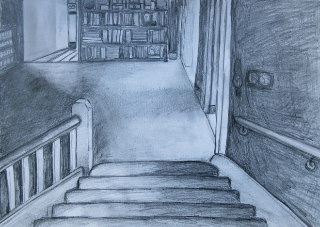
‘- A2 pencil and graphite drawing of a view down the stairs.
– We both agreed this is a very successful drawing. It is informed by your previous images of this view in pastel and ink, and you have developed the image further, especially in the
attention given to qualities of light as it comes through three doors into the downstairs
hallway. The light on the stairs is also nice. As a viewer I feel invited into the space and to
appreciate the various throws of light.’
This is the drawing I didn’t send in and glad to have shown via a video call. I wasn’t very keen on it when I made it, and felt, technically it was a bit poor. But after talking to my tutor could see that I have captured the light from three doors that reflected over the hall floor, was, in fact, a successful drawing. I drew this with a very soft pencil and it took me a couple of hours to do. Feeling pleased now.
Project 2 – Still Life
Exercise 1 – Still life using line
‘- You developed an ink and pastel drawing into a long format zig-zag book of hag stones.
The zig-zag format offers a sensation of the hag stones spread out in a horizontal, low down,
landscape and this seems to suit the subject matter.
– After our tutorial I looked again at your zig-zag book of oyster shells in your sketch book.
They are rich and lively in the way they are made up of loose texture and colour, and
almost feel like portraits of individual oyster shells.’
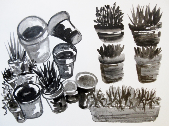
Drawing my Hag Stones was great fun. I put them in a zig-zag format as I had spread my vast collection out on a table, and it took me back to Cromer beach where I had collected them. The scene is vast and full of texture and contrast. So the zig-zag seem a great way to display the drawings for the viewer to feel like you are there looking at the stones.
The Oyster shells and in fact all my natural objects are quite personal to me and that’s probably why they come out as ‘portraits’.

Hag stones

Hag stones

Hag stones
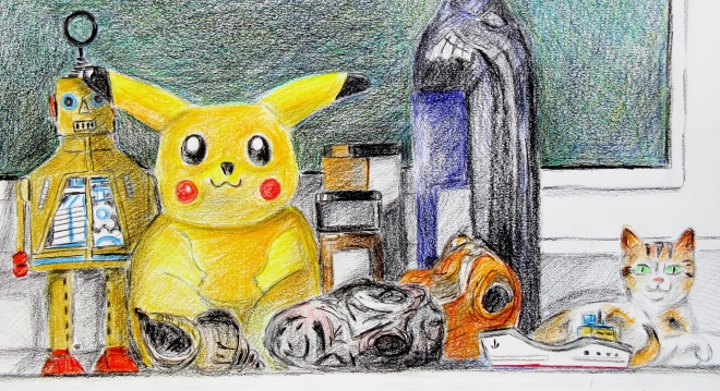
Exercise 2 – Still life, tone using colour
‘- For your still life on a window sill, including Pikachu, you used coloured crayons. These
crayons don’t seem to have offered you an optimum range or versatility of colour and tone.
– It could be worth redoing this exercise about tone using colour. Perhaps there is a way to
approach this ‘still life’ as well, informed by your sketches around the home, so that the
set-up is of more interest to you.’
I do agree with my tutor and will re-draw this exercise. I liked my subject and objects, but again I used coloured crayons, which did not give the tonal effects asked in the brief.
Exercise 3 – Mixed media
Yes, for me, this was a frustrating exercise in this course. I tried many versions, a pen and watercolour drawing, a large paper and pen still life and finally a large shell (inspiration from my 50 Drawings in Four Hours exercise) all using ‘mixed media’ such as paper, inks and the like. I also made a lino cut on a collage too. I tried everything I knew and I still don’t like mixed media formats. I could have drawn and painted all my work as individual pieces, without the stress of ‘making’ and using mixed media items. All I can do is congratulate myself for trying so hard and producing some work.
However, the very activity of cutting out is something I enjoy, it’s physical and instead of drawing lines, the scissors do the guiding and making of the shapes which can be uniform or very abstract. Matisse cut out coloured paper to make wonderful art pieces.

Finished painting

Second attempt at a background

Still life in watercolour,wax and felt pen.

Still life on collage
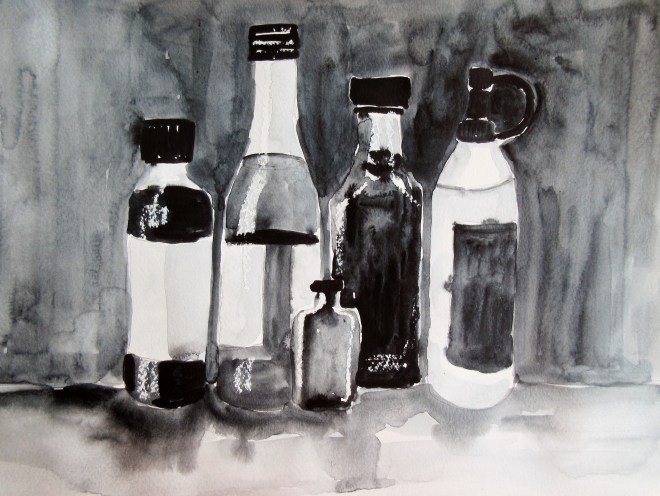
Exercise 4 – Monochrome
‘- Two very different uses of materials, both successful in their own ways.
– A still life of bottles in watercolour with wax highlights and gaps in paint used to create light.
You had looked at Morandi and practised some of his attention to exactly how objects stand
together.
– White ink on black paper used to draw shells, created a lace-like effect, which is effective.
It reads more like a design as the background is flat black and doesn’t address how the shells relate in space.’
The bottles in the monochrome image was joyful to paint. Watercolour techniques are my strongest skill and even though this didn’t stretch me too much, the effect of loose washes and gaps for highlights works to explain the light on the bottles.
Artist Research
My tutor has recommended looking at Rene Magritte, as I had researched Tang Yau Hoong. I quite like humour in art and it’s probably why I chose to draw Pikachu in exercise 2-Still Life, tone and colour. So I will look at Magritte’s art. I really spent sometime reading about Morandi, and saw some of his work in The British Museum in August. I was very interested in the way he moved is objects around until he ‘got’ a composition worthy of painting.
I have already followed up Lee Lozano and Majolica ceramic technique, but will put it in my blog.
For me to do
I agree with my tutor;
Strengths
Your drawings done in location directly from
life, for example, domestic scenes, are
particularly strong
Successful development of subtle shifts of
light and dark areas within images of
domestic interiors, e.g. in your several
versions of a view looking down the stairs.
Drawing the home was my favourite exercise to do. And I worked hard to look at light and dark tones to describe the house.
Areas of Development
The exercise on colour and tone was done
with crayons which didn’t seem to offer much
tonal depth. It could be worth doing this
exercise again with more tonal variation,
perhaps using a different medium.
Totally agree and I will re-draw Assignment 2 and exercise 2-Still life, tone using colour.
I want to explore drawing with pastels and more textures in ink.
